Warp Text Personalization
The Warp Text option lets customers type their own text and see it bent into a preset shape, such as an arch, a wave, or a bow tie, instead of sitting on a straight line. It's the option merchants reach for whenever a design calls for stylized lettering, like a logo-style banner or a curved badge, with more shape choices than a simple curve.
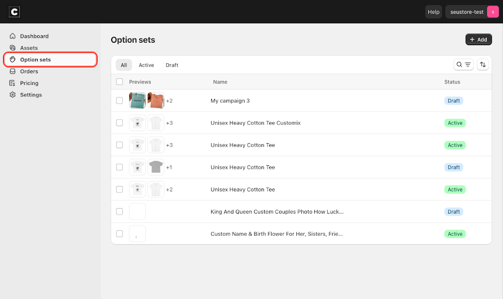
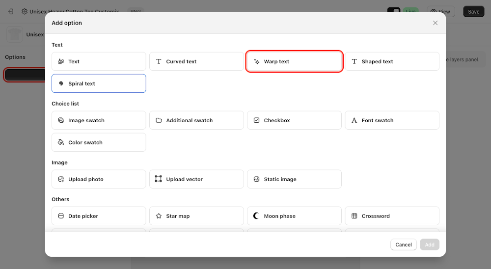
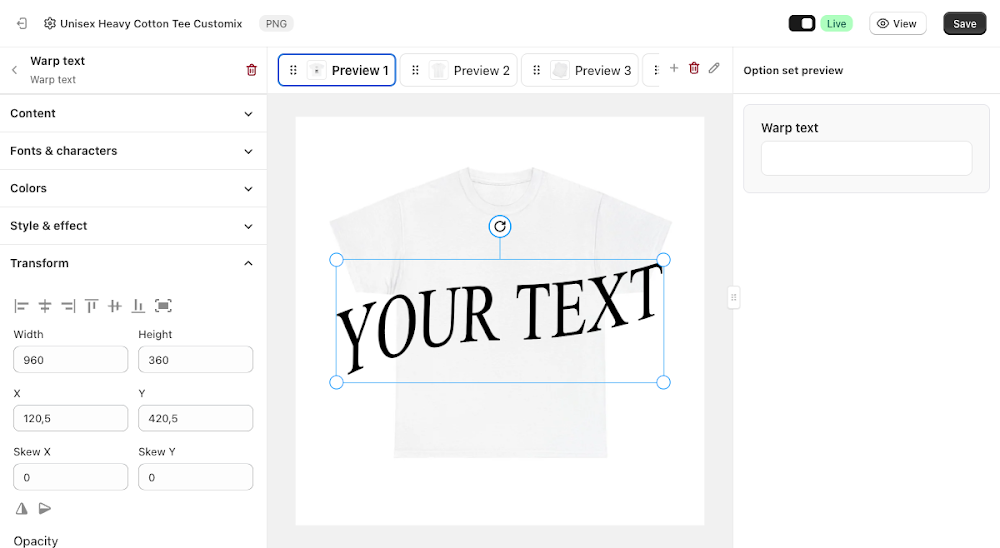
To add it, go to Option sets in the sidebar, open the option set for your product, click Add option, choose Warp text under Text, then click Add. A warped text layer appears on the preview canvas showing sample text, and you can drag, resize, or rotate it into position on the product.

Content
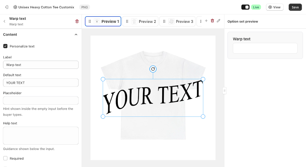
The Content section controls the label, default text, and warp shape.
- Personalize text: lets customers type their own text, checked on by default
- Label: the field name shown above the input, defaults to "Warp text"
- Default text: the sample text shown on the preview canvas before a customer types anything, defaults to "YOUR TEXT"
- Placeholder: hint text shown inside the empty input before the customer types
- Help text: optional guidance shown below the input
- Required: the customer must enter text before they can add the product to cart
- Is paragraph: switches the input to a multi-line textarea instead of a single line
- Move with bounding box: keeps the box frame fixed and lets the text move and resize inside it, double-click the layer to edit the text directly
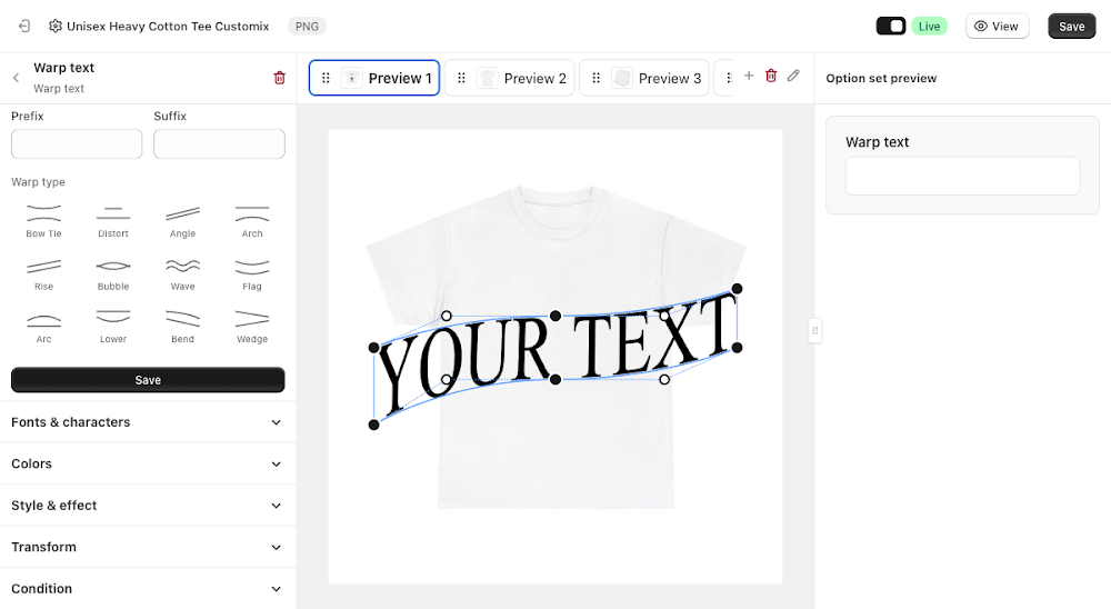
Below those fields, the same panel holds the warp controls: Prefix and Suffix add fixed text before or after whatever the customer types, Warp type offers twelve preset shapes (Bow Tie, Distort, Angle, Arch, Rise, Bubble, Wave, Flag, Arc, Lower, Bend, Wedge) to bend the text into, and Edit warp points switches the canvas into a drag mode for sculpting a fully custom shape instead of using a preset.
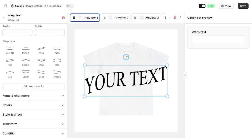
Clicking Edit warp points reveals draggable handles along the text's bounding box, letting you pull the corners and midpoints to warp the text into a custom shape.
Fonts & characters
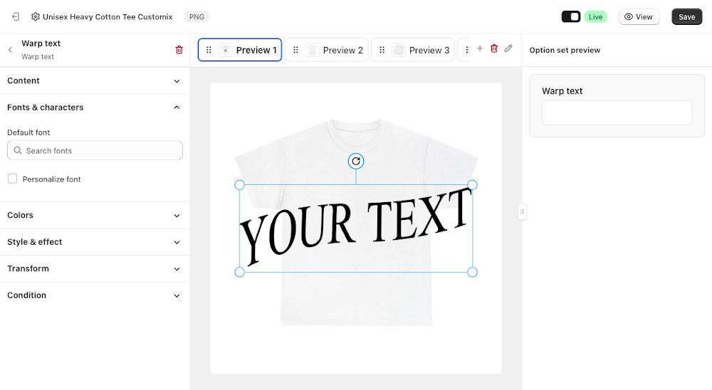
The Fonts & characters section controls typography.
- Default font: search and pick the font used for the warped text
- Personalize font: lets customers choose their own font on the storefront, off by default
Colors
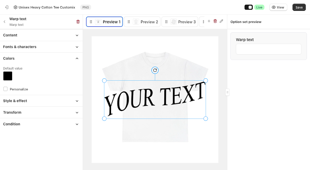
The Colors section controls the text color.
- Default value: the color applied to the text, black by default
- Personalize: lets customers pick their own text color on the storefront, off by default
Style & effect
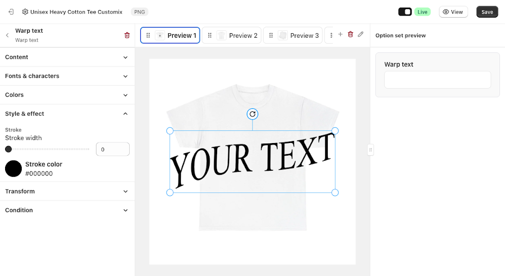
The Style & effect section adds an outline around the text.
- Stroke width: thickness of the outline, 0 by default (no stroke)
- Stroke color: color of the outline, black by default
Transform
Fine-tune the warped text layer's width, height, X/Y position, skew, opacity, and rotation, the same controls available on every other layer type, to nudge it into exactly the right spot on the mockup.
Like most option types, Warp Text also supports conditions, so you can show or hide it based on another selection elsewhere in the option set. See the Conditional Option Sets guide if you want to set that up.
📌 Don't forget to click Save once you're happy with the setup, and make sure the option set's status is Active (not Draft). Customers won't see the Warp Text option on your storefront until both are done.
Updated on: 15/07/2026
Thank you!