Image Swatch Personalization
The Image swatch option lets customers pick from a set of named images, where each choice actually swaps the artwork shown on the canvas. It's the option to reach for when a design has real visual variants, like different colorways of the same illustration, rather than a plain value picker like Additional Swatch.
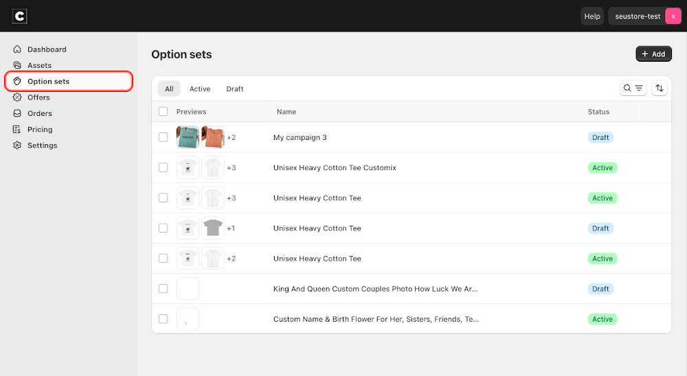
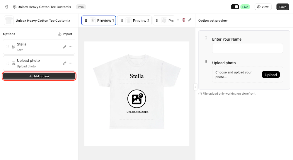
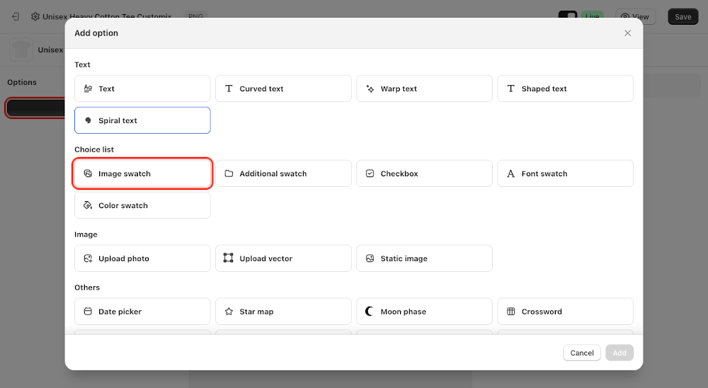
To add it, go to Option sets in the sidebar, open the option set for your product, click Add option, choose Image swatch under Choice list, then click Add.
Content
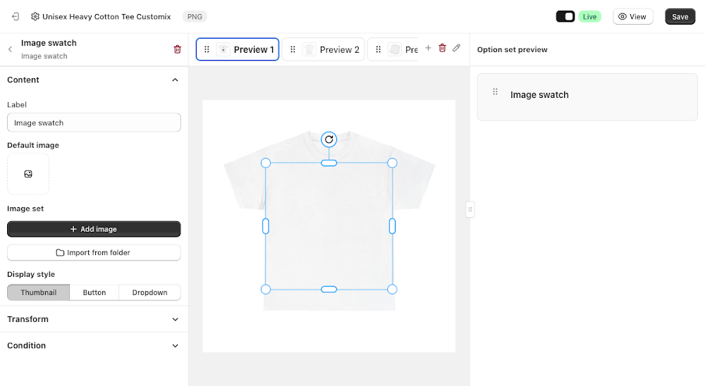
The Content section controls the label, the images customers pick from, and how they're displayed.
- Label: the field name shown above the picker, defaults to "Image swatch"
- Default image: an independent fallback image, picked from any asset in your library, not necessarily one of the swatch values below
- Image set: empty at first, with Add image (upload or pick a single file) and Import from folder (bulk-add every file already in an Assets folder) to populate it
Clicking Import from folder opens the Assets library. Unlike Additional Swatch, which reads a folder's sub-folders, Image swatch reads a folder's own image files directly, so a flat folder like "Choose Color" works as-is. Tick the folder's checkbox in the Folders list (don't navigate into it, clicking a folder's name opens it instead of selecting it) and click Done.
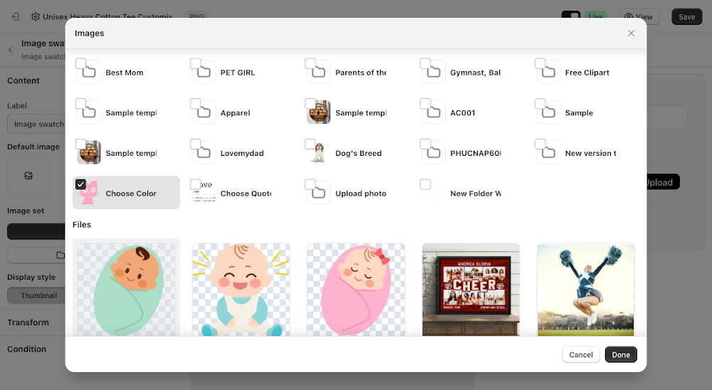
Every file in that folder becomes one value in the Image set, named after its filename, with the first one set as Default automatically.
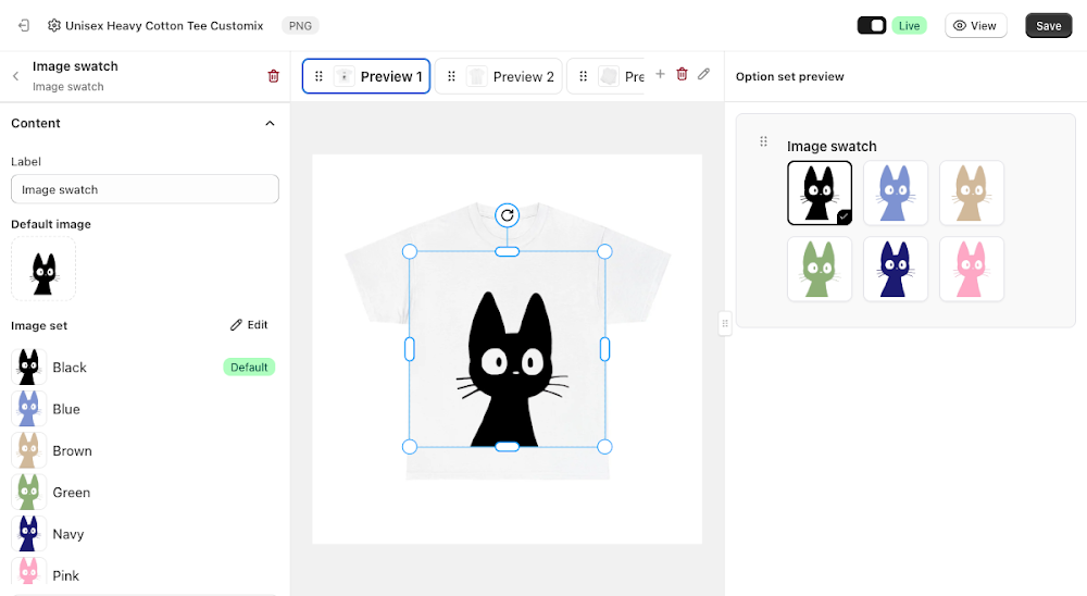
- Display style: choose Thumbnail to show each value as an image tile, Button to show them as text buttons, or Dropdown to show them as a select menu

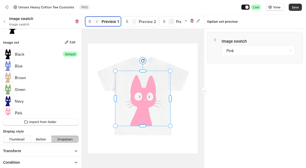
How it renders on the canvas
This is what sets Image swatch apart from Additional Swatch: picking a value doesn't just record a choice, it redraws the option's own canvas layer with that image. Selecting Pink immediately swaps the artwork on the product mockup to the pink version.
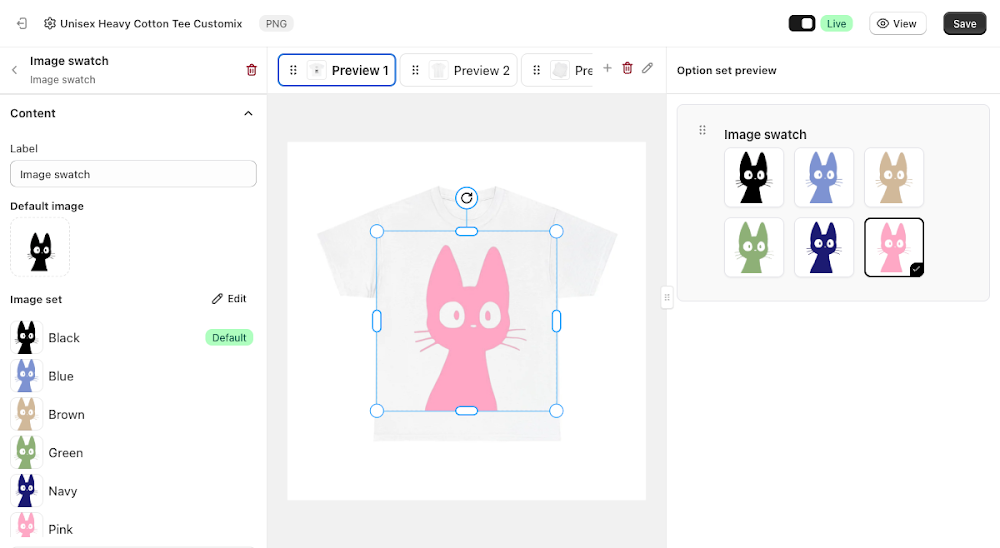
Condition
Like most option types, Image swatch supports its own conditions, so you can show or hide it based on another selection elsewhere in the option set. Because each value has its own name (Black, Blue, Brown...), those names also show up as separate entries in other options' Condition pickers, the same way Additional Swatch's values do. See the Conditional Option Sets guide if you want to set that up.
📌 Don't forget to click Save once you're happy with the setup, and make sure the option set's status is Active (not Draft). Customers won't see the Image swatch option on your storefront until both are done.
Updated on: 17/07/2026
Thank you!