Clock Personalization
The Clock option renders an actual analog clock face on the canvas, hands and all, set to whatever time the customer picks. It's the option to reach for when a design should feel like a real timepiece tied to a meaningful moment, a birth time, a proposal, a wedding ceremony, rather than a plain line of text.
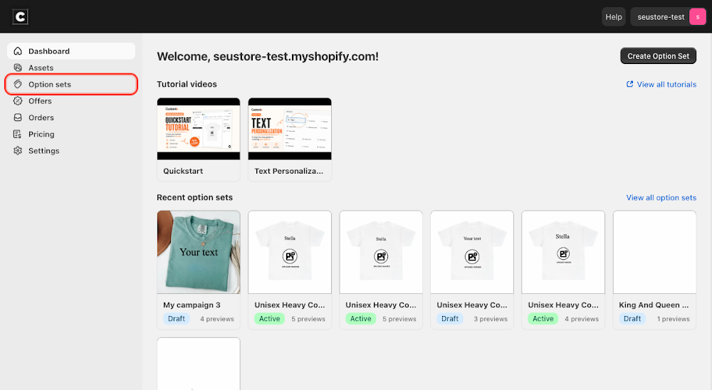
To add it, go to Option sets in the sidebar, open the option set for your product, click Add option, choose Clock under Others, then click Add.

Content
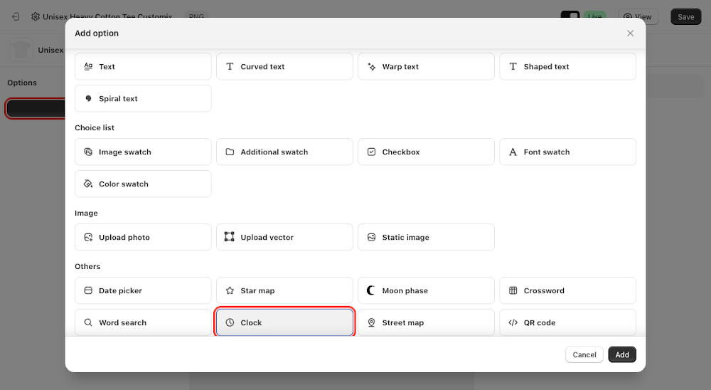
- Label: the field name shown above the time picker, defaults to "Clock"
- Help text: optional guidance shown below the label
- Time format: choose 24 hour to show the storefront time picker as a bare
HH:MM, or 12 hour (AM/PM) to add an AM/PM suffix to it (e.g. "10:10 AM") - Required: forces the customer to pick a time before they can complete the order
- Default value: the starting time shown before a customer edits it, auto-filled with the current time when the option is added

Clicking the time field in the Option set preview opens an Hours/Minutes picker. Picking a time redraws the clock's hour and minute hands to match, and updates the AM/PM text on the face automatically.
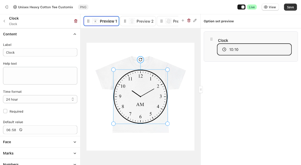
Switching Time format to 12 hour (AM/PM) adds the AM/PM suffix directly to the time picker button itself, on top of the AM/PM text that already renders on the clock face regardless of this setting.

Face
Controls the plate the hands and numbers sit on.
- Show face border: ticked by default, draws an outline around the clock face
- Fill color: the face's background color, transparent by default
- Border color: the outline color, defaults to black
- Border width: outline thickness in pixels

Marks
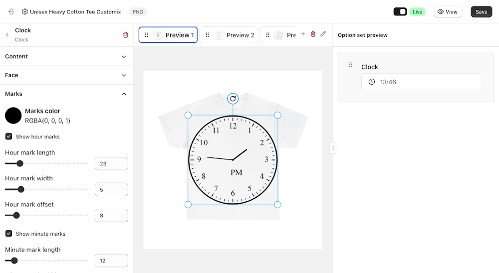
Controls the tick marks around the face's rim, hour marks and minute marks are configured separately.
- Marks color: the color of every tick mark, defaults to black
- Show hour marks / Hour mark length / Hour mark width / Hour mark offset: toggles the 12 longer hour ticks and controls their size and distance from the rim
- Show minute marks / Minute mark length / Minute mark width / Minute mark offset: toggles the 60 shorter minute ticks and controls their size and distance from the rim
Numbers
Controls the numerals printed around the face.
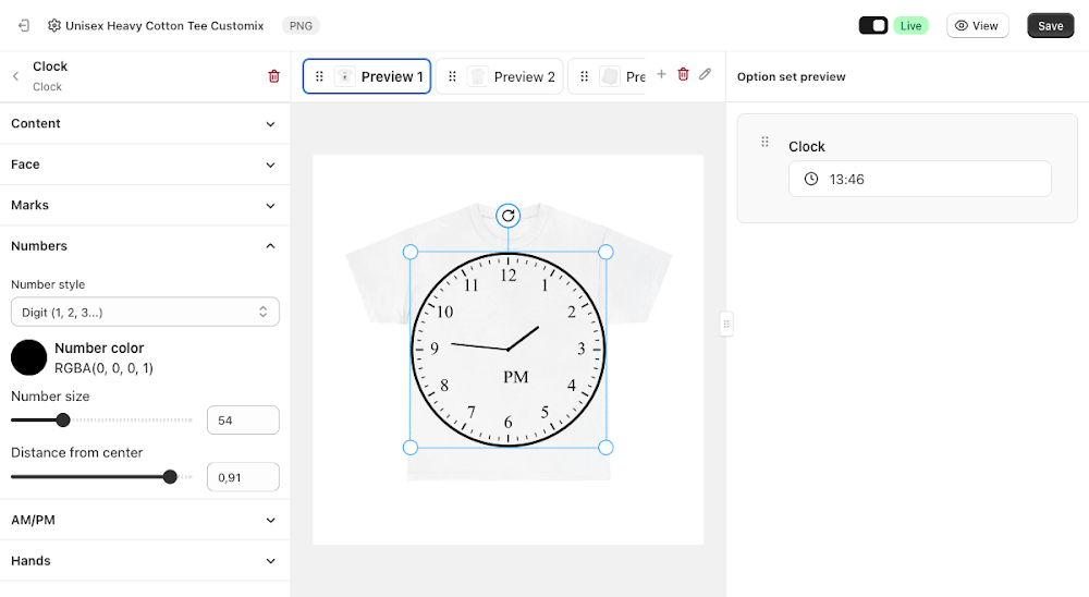
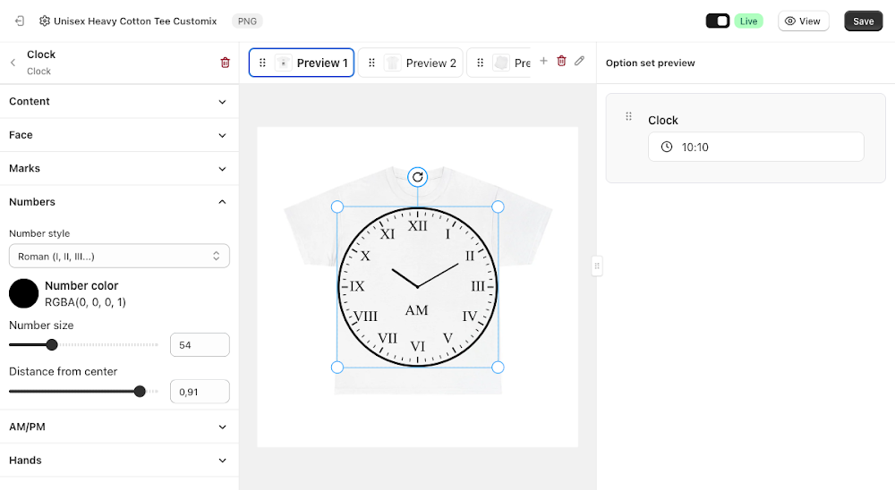
- Number style: choose Digit (1, 2, 3...), Roman (I, II, III...), or None to hide numbers entirely
- Number color: defaults to black
- Number size: as a percentage
- Distance from center: how close the numbers sit to the face's edge
Switching Number style to Roman immediately redraws the face with Roman numerals instead of digits.
AM/PM
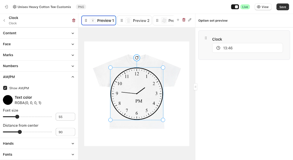
Controls the small AM/PM label printed on the face itself. This always renders regardless of the Content section's Time format setting, since that setting only affects how the storefront time picker button is labeled, not the face.
- Show AM/PM: ticked by default
- Text color: defaults to black
- Font size: as a percentage
- Distance from center: how far the label sits from the center of the face
Hands
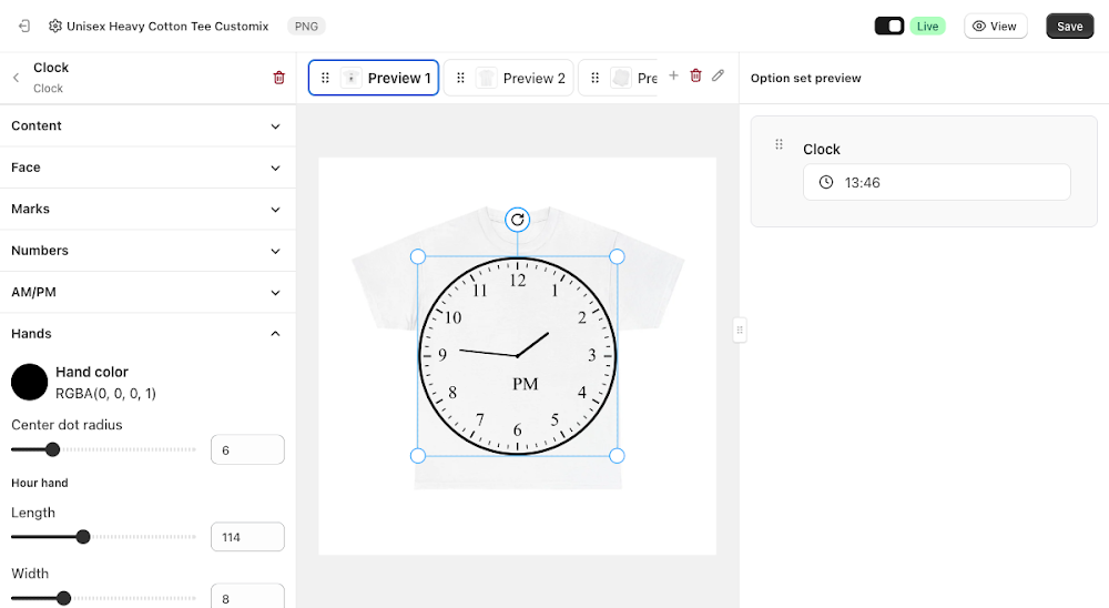
Controls the hour and minute hands. There's no second hand, the clock always renders just hours and minutes.
- Hand color: applies to both hands, defaults to black
- Center dot radius: size of the pivot dot at the center of the face
- Hour hand: its own Length, Width, and Tip style (Round, Flat, or Pointed)
- Minute hand: its own Length, Width, and Tip style, same three choices
Fonts
Controls the font used for the numbers on the face.
- Default font: search and pick a font
- Personalize font: lets the customer change the font themselves
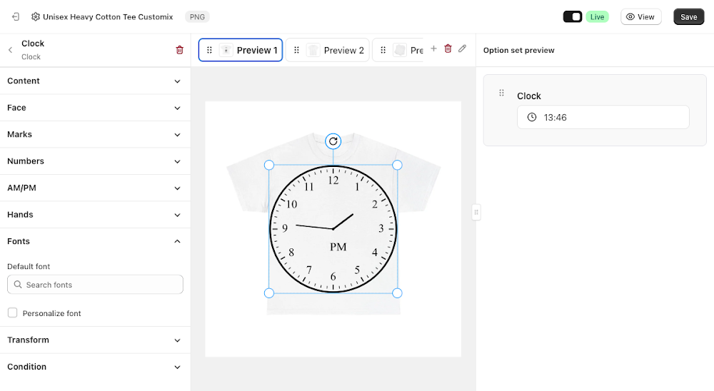
Transform
The standard Width, Height, X, Y, Skew X, Skew Y, alignment, flip, Opacity, and Rotation controls for positioning the clock on the canvas, the same Transform panel shared by other canvas-based option types.
Condition
Like most option types, Clock supports its own conditions, so you can show or hide it based on a selection elsewhere in the option set. See the Conditional Option Sets guide if you want to set that up.
📌 Don't forget to click Save once you're happy with the setup, and make sure the option set's status is Active (not Draft). Customers won't see the Clock option on your storefront until both are done.
Updated on: 20/07/2026
Thank you!